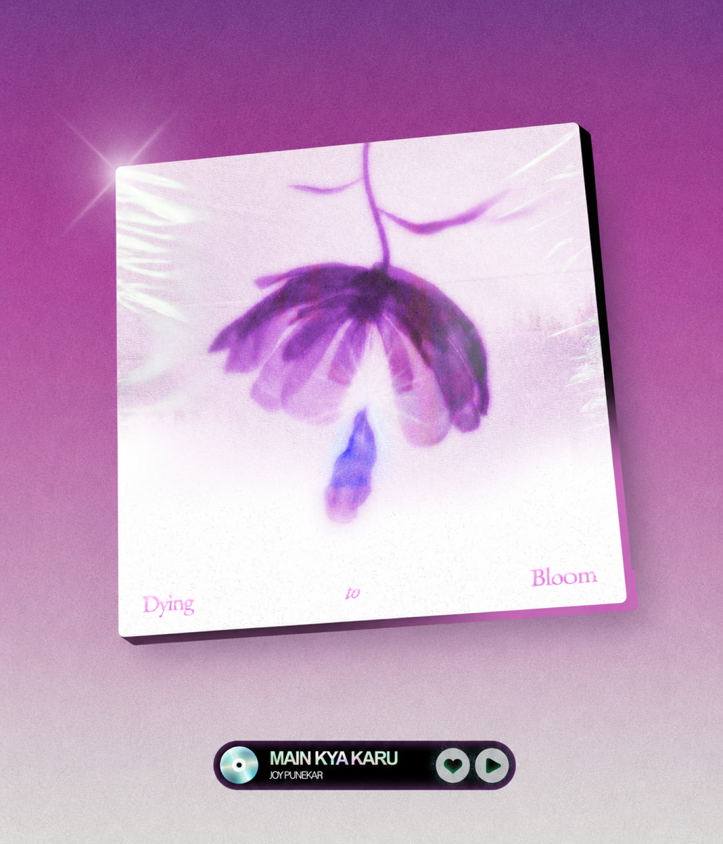
DYING TO BLOOM
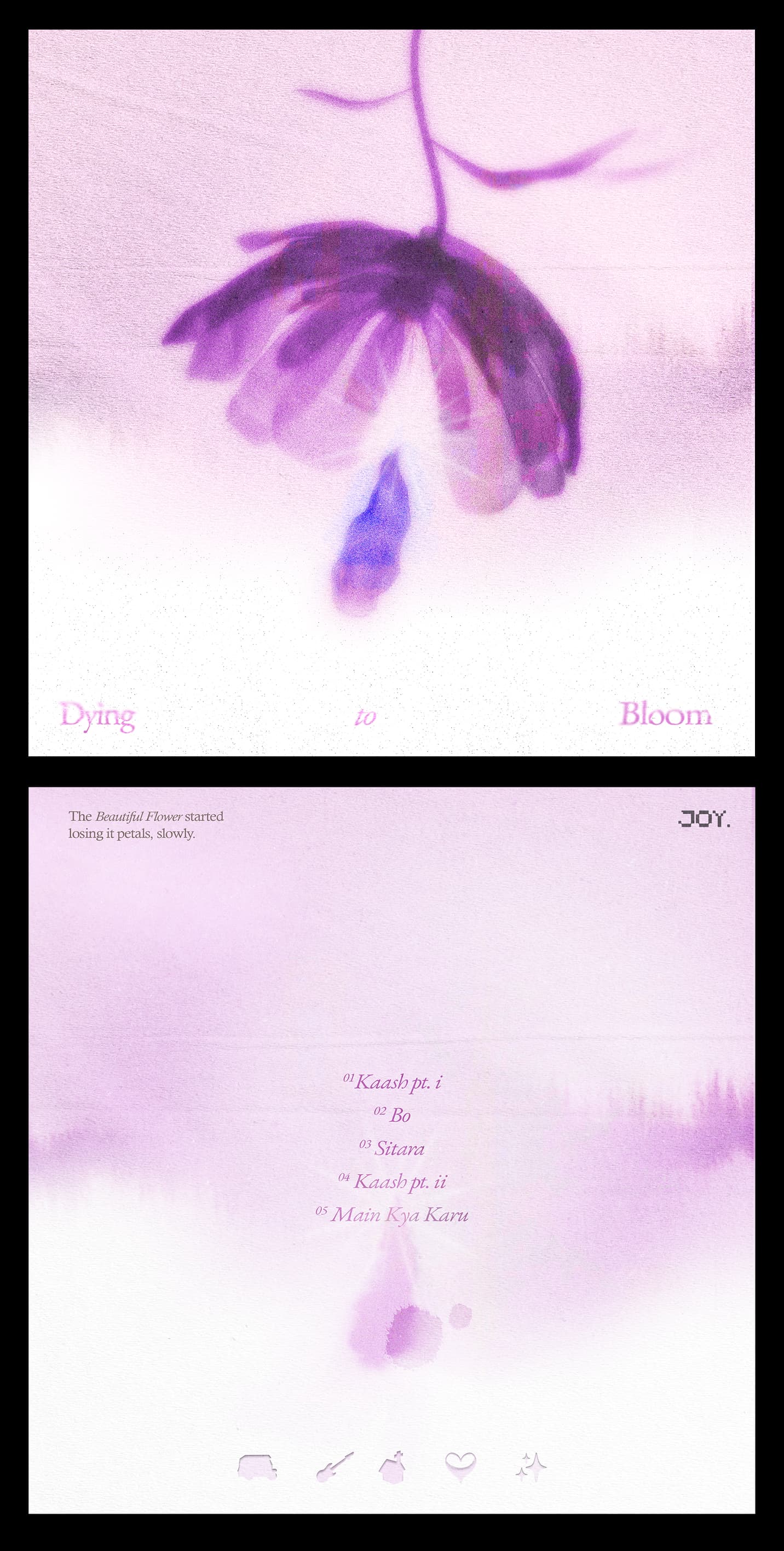
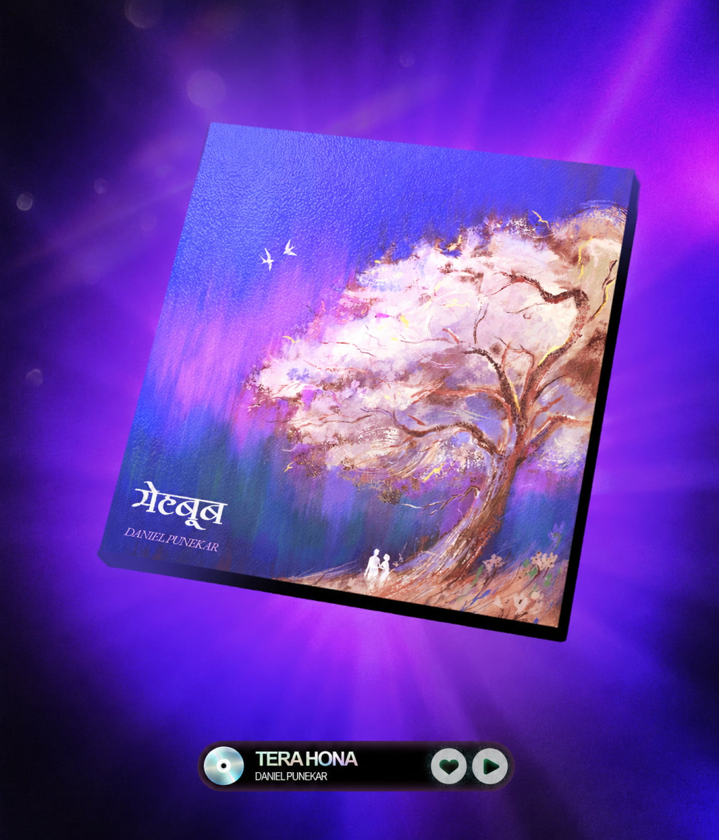
Dying to Bloom is the visual identity for Joy Punekar's debut EP, created to communicate the emotional world of the music into tangible visual output. The project explores a relationship that once grew with love, but gradually became a memory as the two people quietly drifted apart.
The brief was to create an album cover around a past relationship that remained emotionally present long after it was over. Two people who once grew together and the love flourished but silently drifted apart with time, leaving behind a memory that quietly stayed. The client wanted minimalism, flowers and the color purple.
Rather than illustrating heartbreak literally, I wanted the artwork to feel like a memory—soft, imperfect, and distant. The artist spoke about looking back at the relationship with gratitude rather than sadness, which led me to one question:
How can I show something that grew, but not in the way it was meant to?
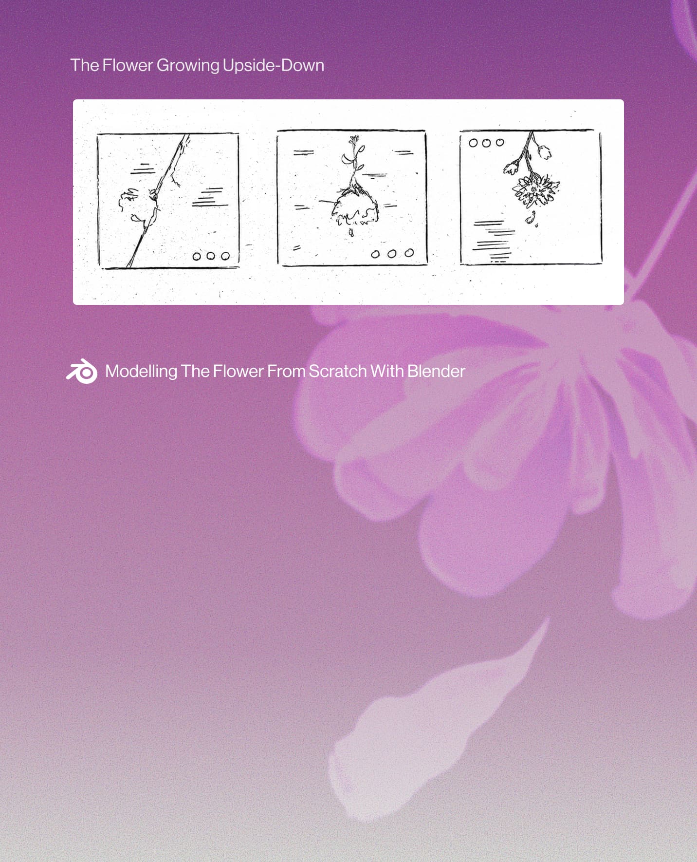
With that question, I started sketching out ideas, and an upside-down flower emerged as the strongest representation of the message. It suggests something that grew, but instead of growing up, it grew downwards, and gradually started wilting away. A prefect representation of the message.
The process began with rough, almost childlike sketches to find the meaning behind the visual before thinking about execution. Once the flower felt like the right metaphor, I modelled it from scratch in Blender and began building the artwork around it.
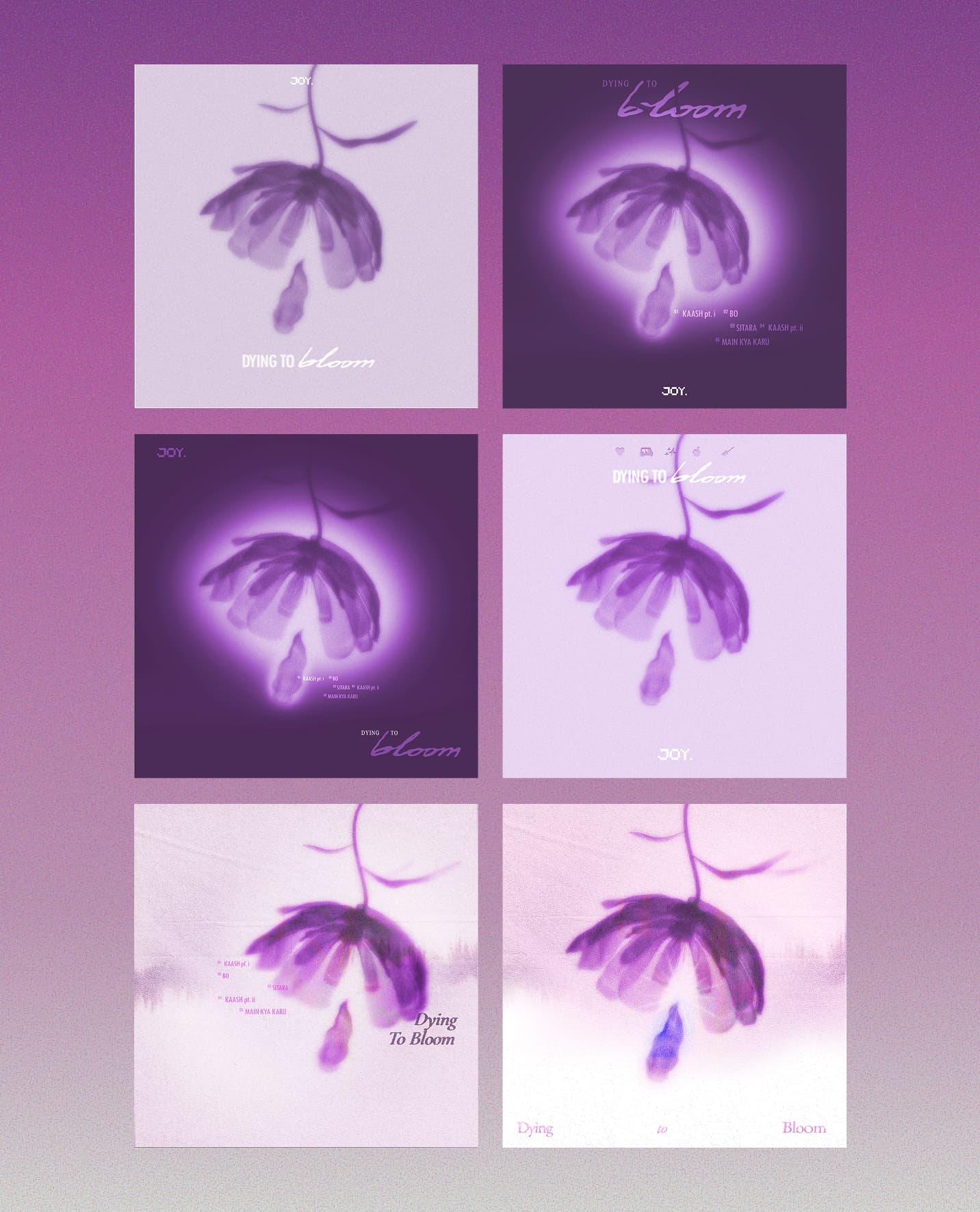
I explored expressive, experimental, and minimal type arrangements alongside different compositions and color treatments. Each direction was tested based on which one allowed the central imagery to take the main stage, and not letting colors and type take over.
The more experimental type treatments drew too much attention away from the image, while darker color treatments made the memory feel heavier than intended. The lighter, more restrained direction allowed the artwork to retain its softness and emotional message.
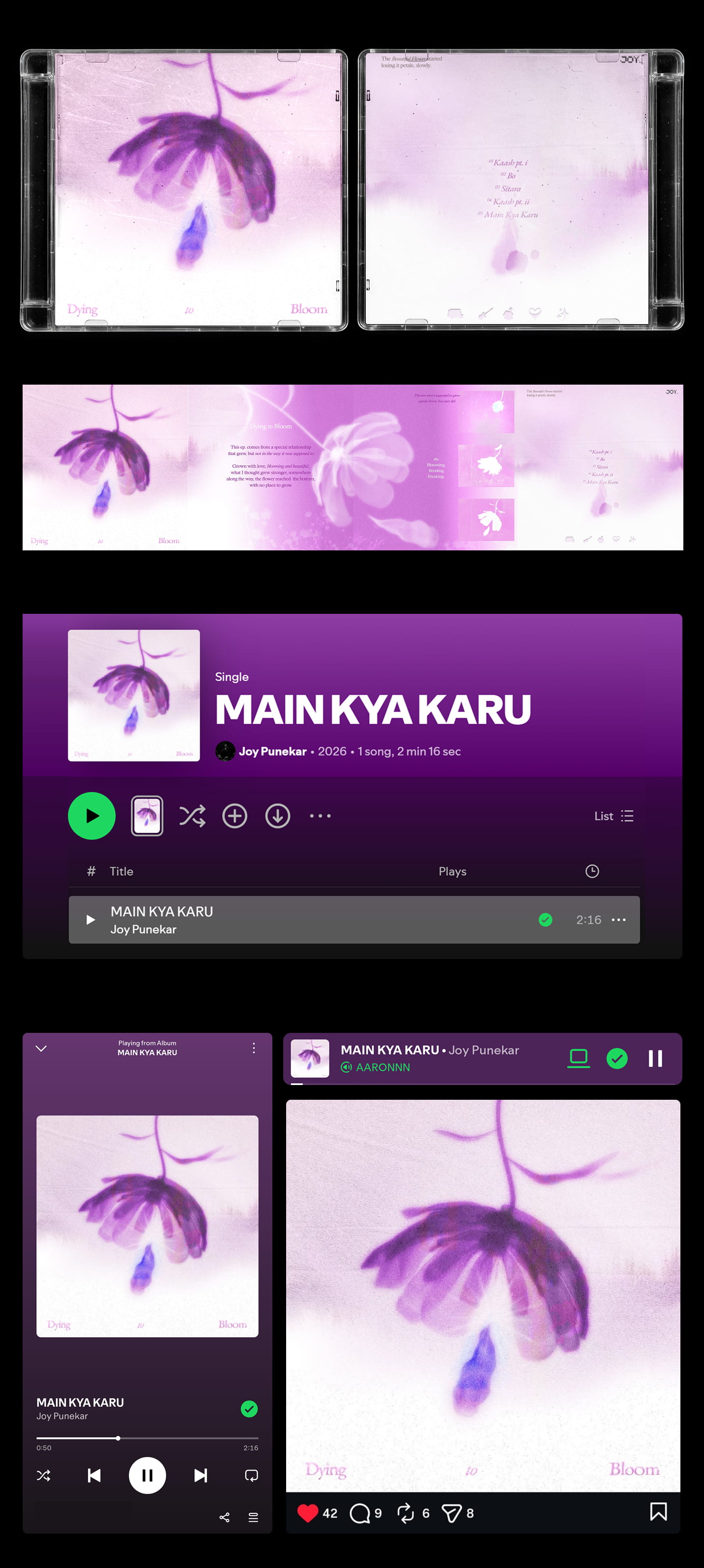
The visual language was extended across the back cover, tracklist, CD artwork, and promotional assets to create a cohesive identity for the EP. Every application preserved the same atmosphere, ensuring the project felt like one complete visual experience.