FILLYFROLLY
FillyFrolly is an experimental branding project built around an imaginary product: Floral Chips. With no existing product or category to work from, the project explored how a simple, unusual idea could be developed into a believable brand with its own purpose, personality, and visual world.
Gen Z is growing up around its own share of uncertainty, stress, and mental-health struggles, making it easy for everyday life to feel heavy. I wanted to explore whether a brand could act as a small, positive companion. Not by solving those problems, but by creating moments of joy, playfulness, and connection.
The idea took inspiration from What a Wonderful World, written by Bob Thiele and George David Weiss in 1967, during a period of war, racial tension, and social unrest. The song was conceived as a hopeful response to that atmosphere: a reminder to notice beauty and human connection even when the world feels difficult.
FillyFrolly carries a similar spirit into a Gen-Z brand. An conceptual floral snack designed to belong. As a small, unapologetic burst of color, playfulness, and joy :))
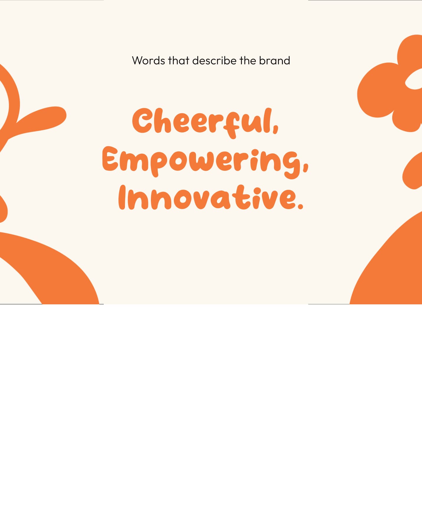
The idea began with a simple question: what could a joyful response to a gloomy world look like? I explored words around joy, play, and carefree moments, until FillyFrolly emerged from frolicking — a carefree, playful movement through the flowers. The rhyme made it fun to say and easy to remember, while capturing the brand's lighthearted personality.
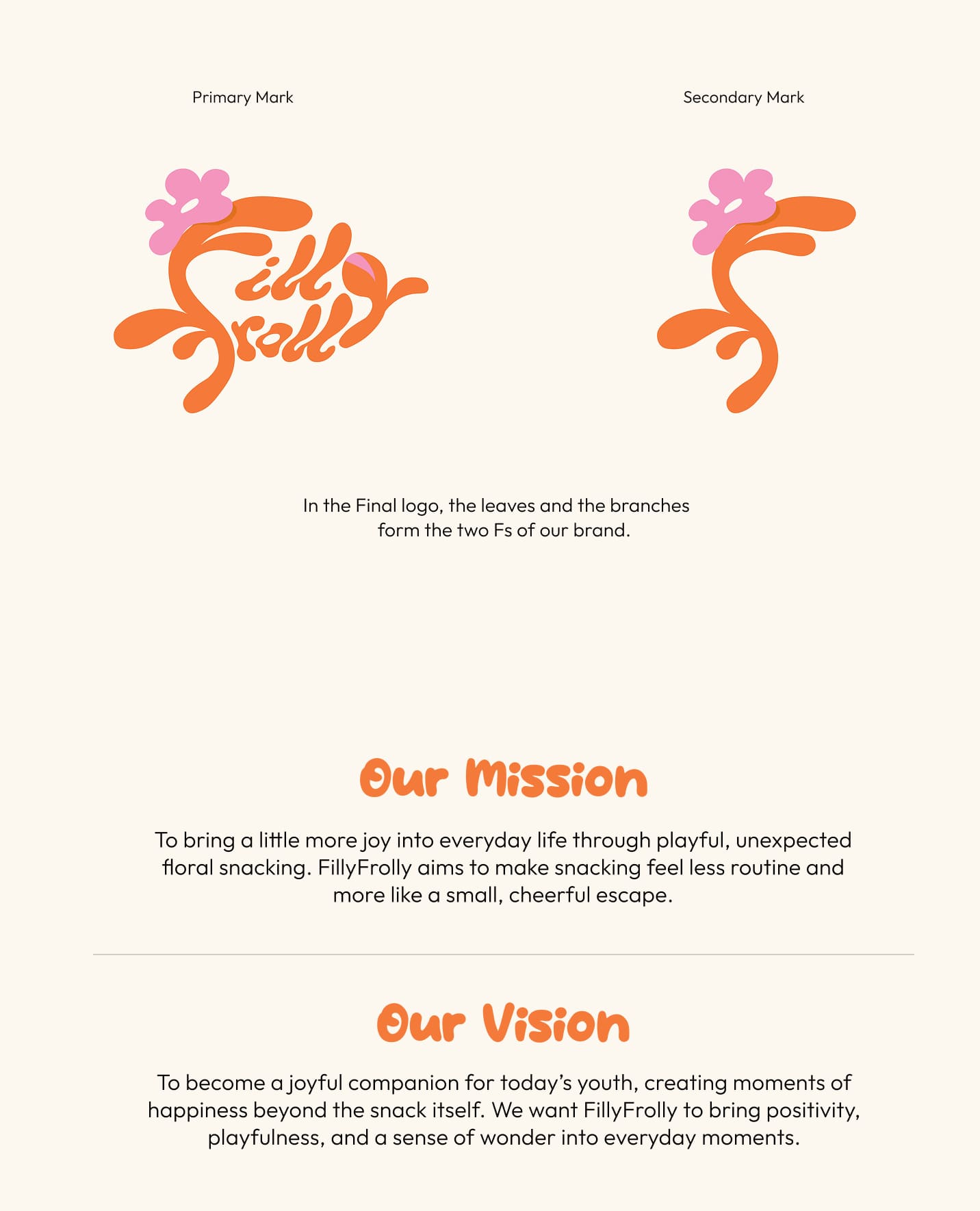
The first exploration imagined Filly as a playful flamingo eating flowers. As I explored further, a wordmark felt more suited to the brand's carefree, organic nature while allowing it to scale across packaging and communication. The final lettering itself brings the playfulness and memorability, while working across different sizes and applications.
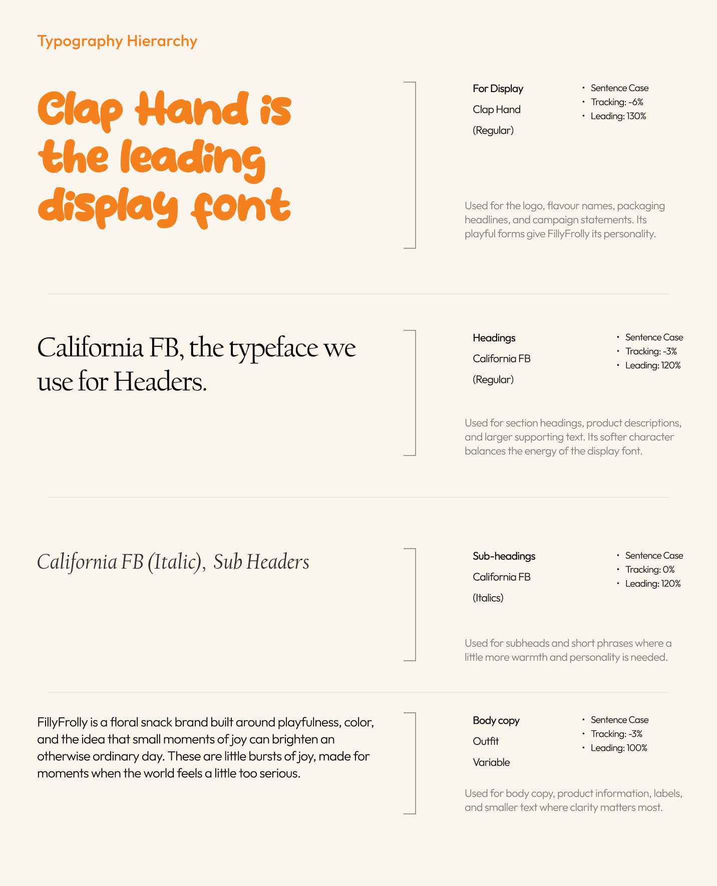
I wanted the typography to carry the same carefree energy as the name and logo. ClapHands became the display typeface because its irregular, playful forms feel like they're having fun, while California FB provides a calmer, more structured voice for supporting information.
The contrast keeps the identity from becoming too childish: ClapHands brings the personality; California FB keeps the system grounded.
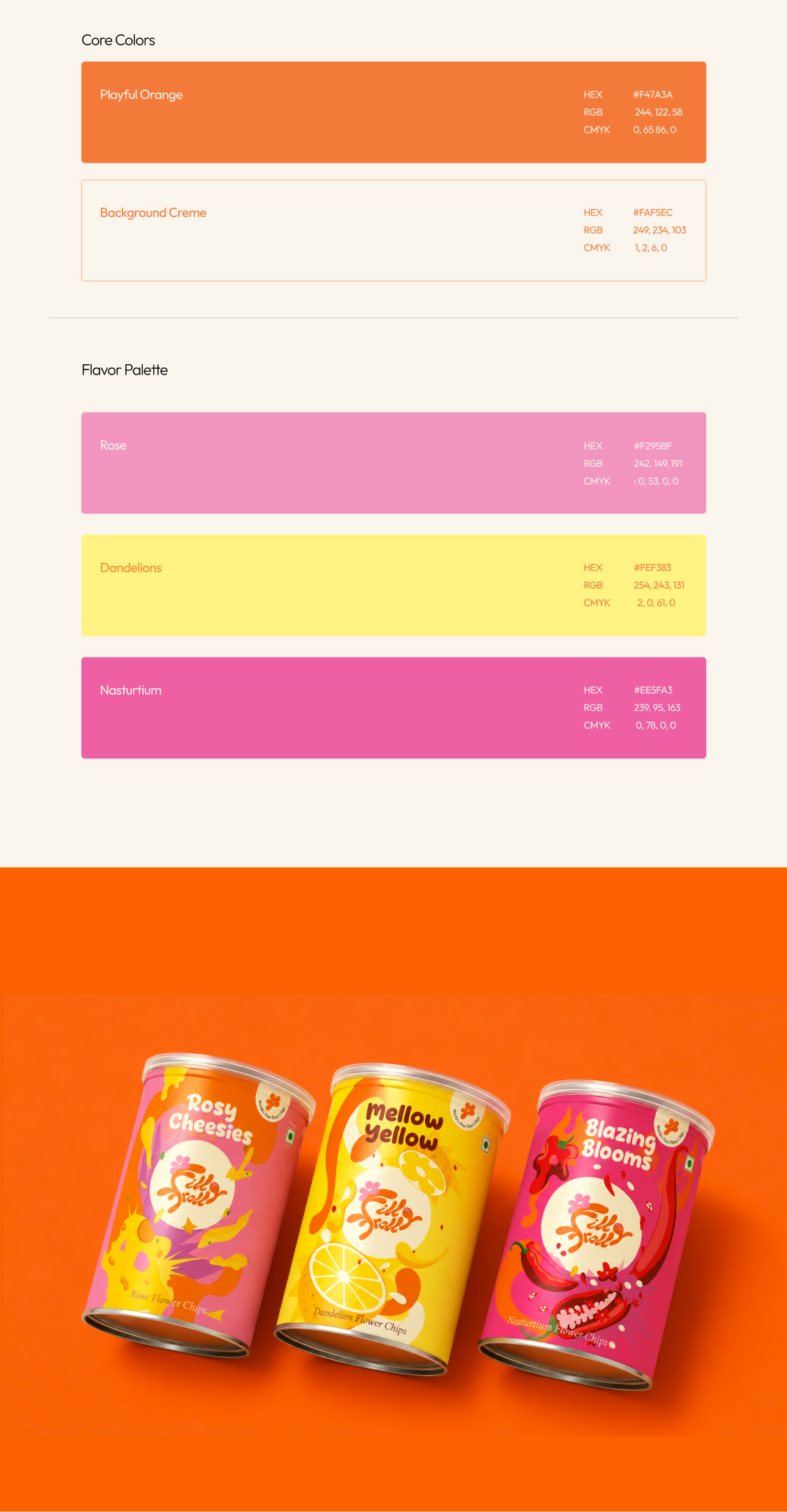
Orange became the core brand color because it felt energetic, warm, and optimistic without being too loud. I paired it with a soft cream to give the identity room to breathe, while the individual flower colors became cues for the different flavours.
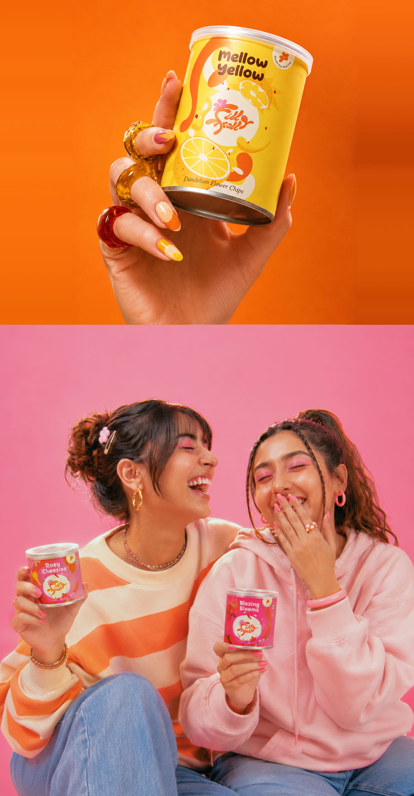
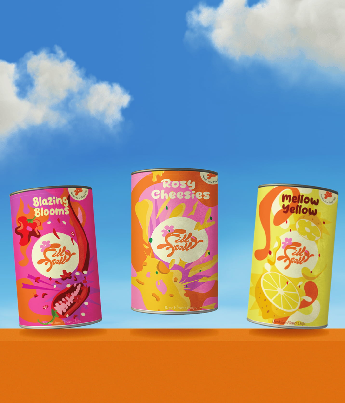
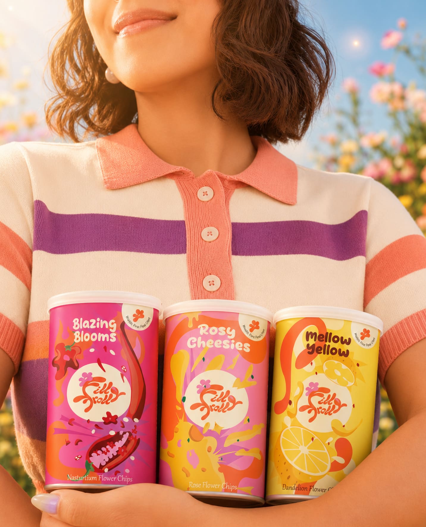
Since floral chips have no existing visual language, the packaging had to make the idea feel believable while keeping it playful. I created the flower illustrations specifically for the packs, using simple, organic forms and flavor-specific colors and graphics to make each variant distinct while keeping the range connected.
Each flavor gets its own flower and color, while the typography, layout, and brand elements stay consistent across the range. This creates enough variation to make each pack recognizable without losing the identity of the overall brand.
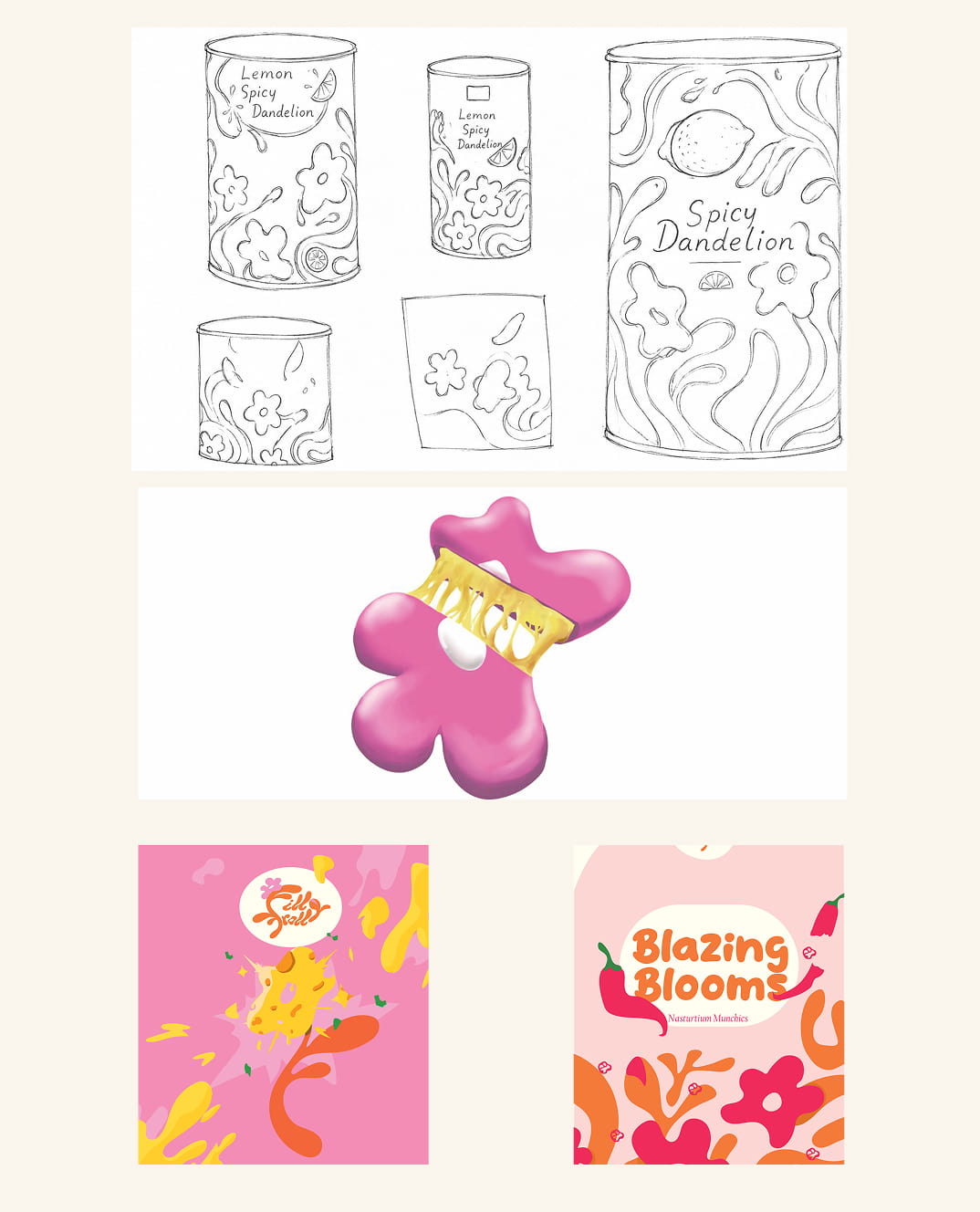
Early packaging explorations tested different layouts, decorative patterns, and some crazy illustrations. Some directions felt too busy or focused too much on individual elements, while others made the packaging feel more like an illustration piece than a snack brand. The final system kept the playful illustration approach, but with a clearer hierarchy and stronger connection to the brand.
Send A Flower Campaign. Turning Joy Into Something You Can Give.
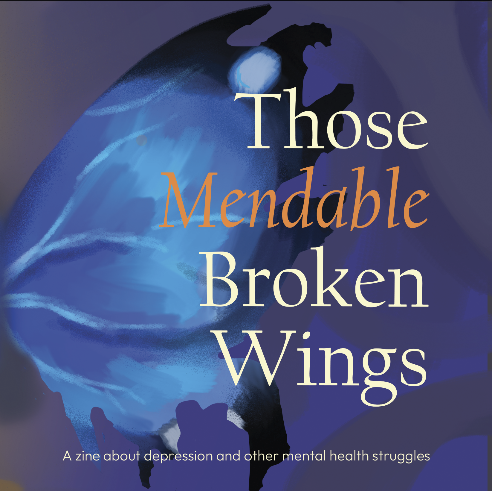
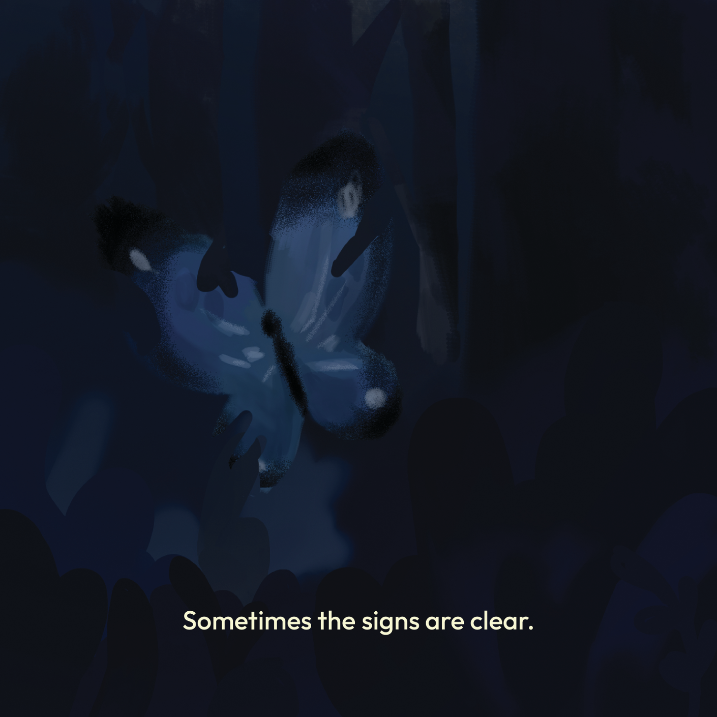
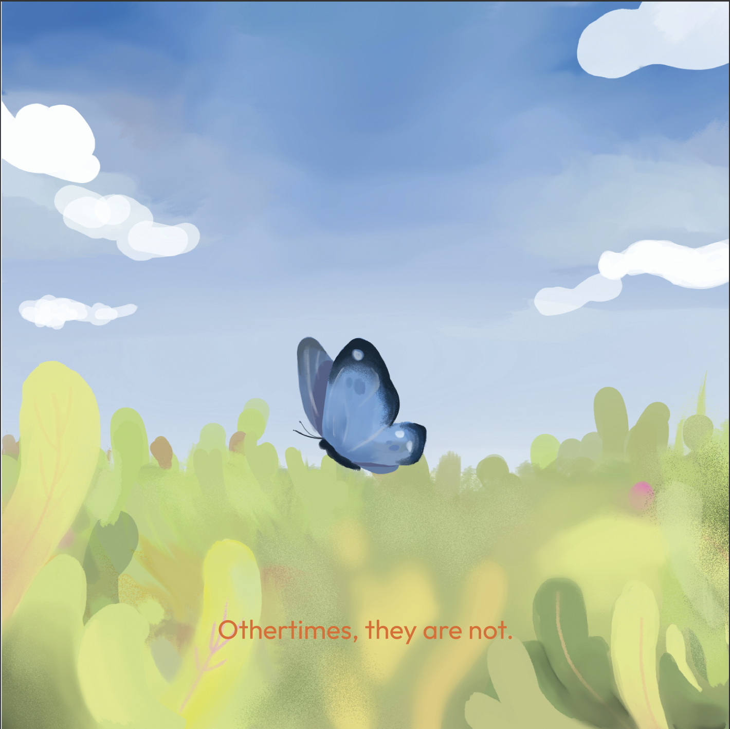
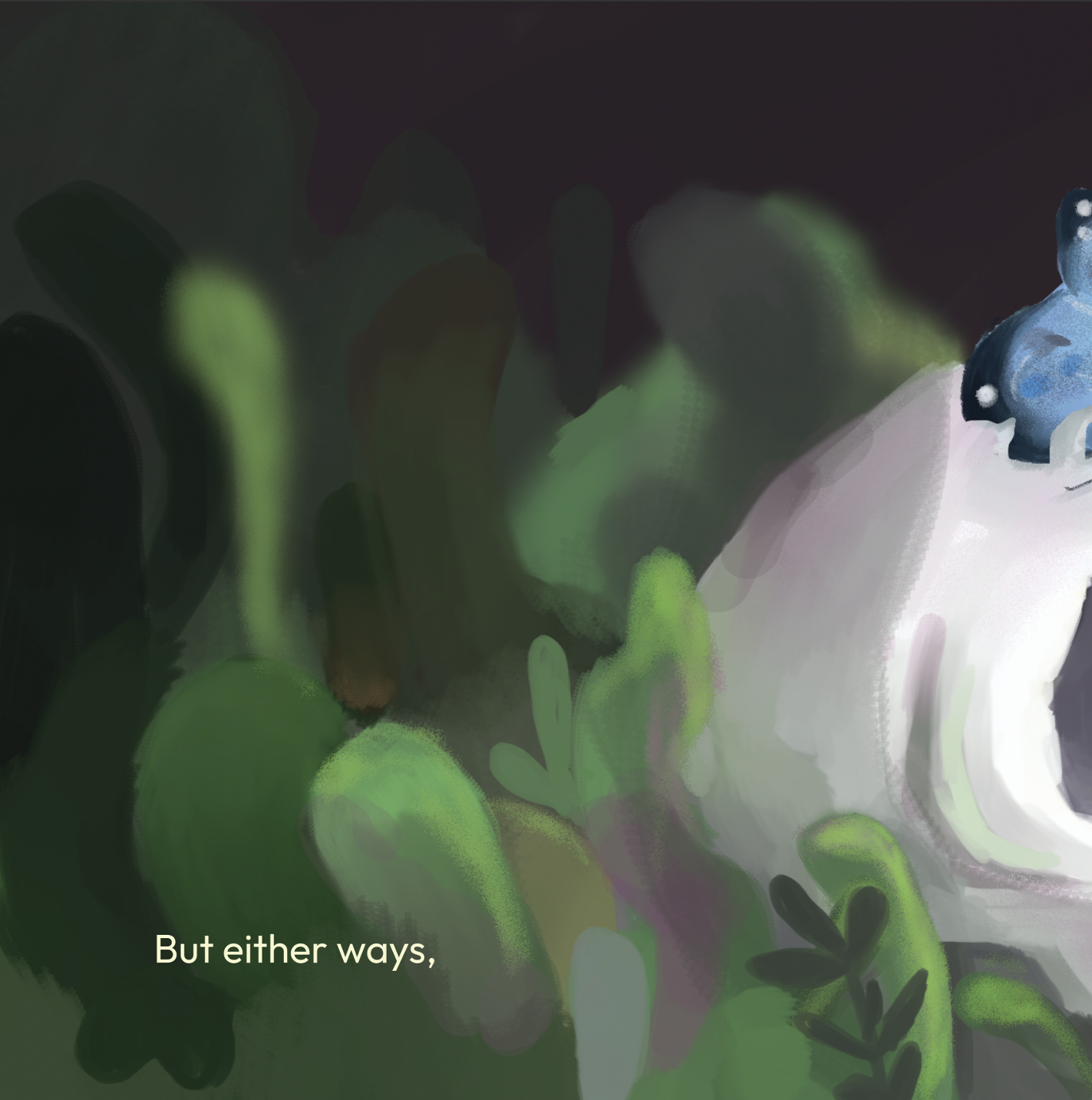
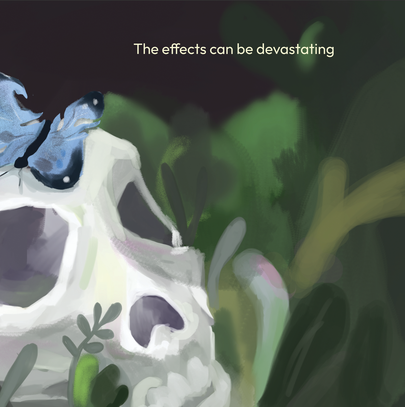
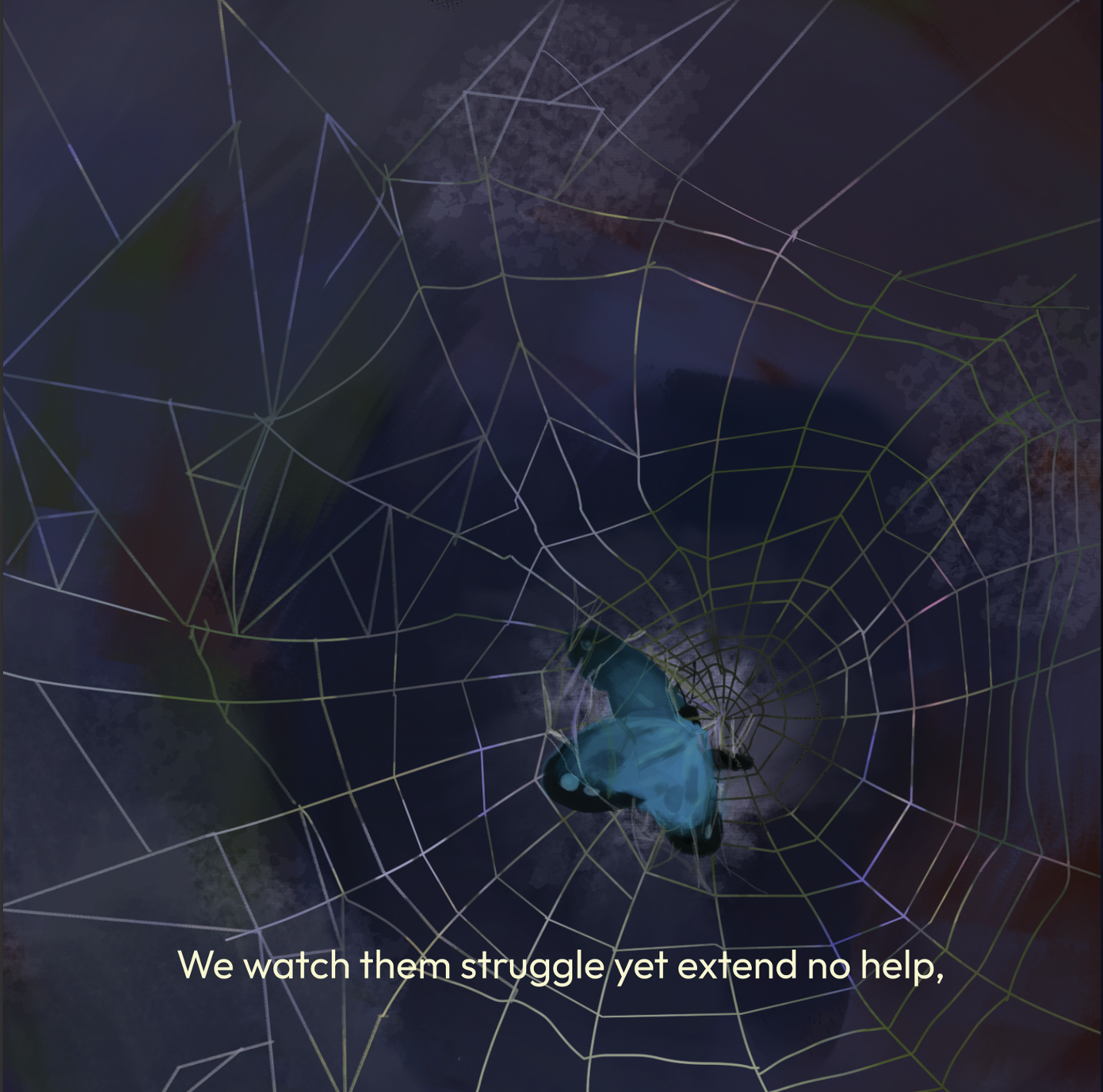
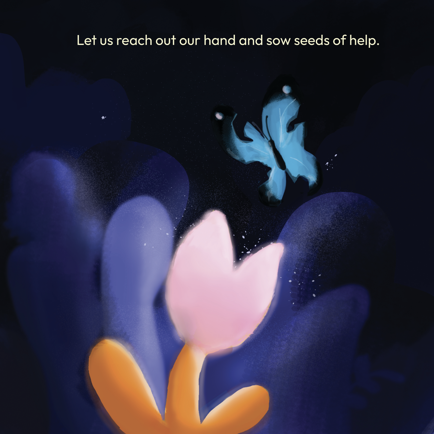
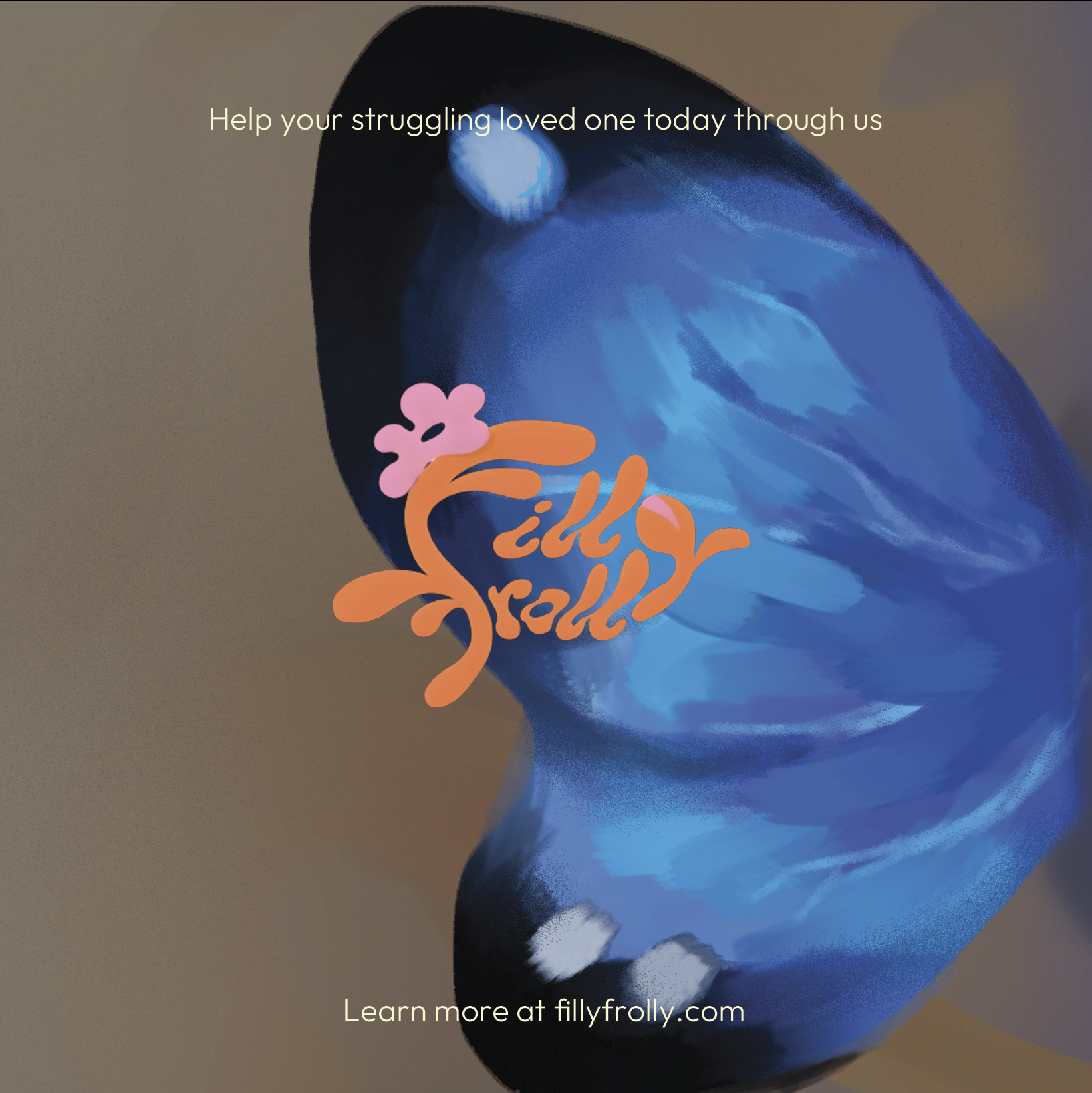
The campaign unfolded through zines distributed in colleges and among young audiences. It began with the idea that someone you love might be silently struggling, represented through a butterfly. The zine guides readers toward noticing, reaching out, and showing they care, before revealing FillyFrolly's answer: send them a flower, a small gift that says I see you. I care about you.
The campaign extended FillyFrolly's purpose beyond snacking, turning joy into something that can be passed on.