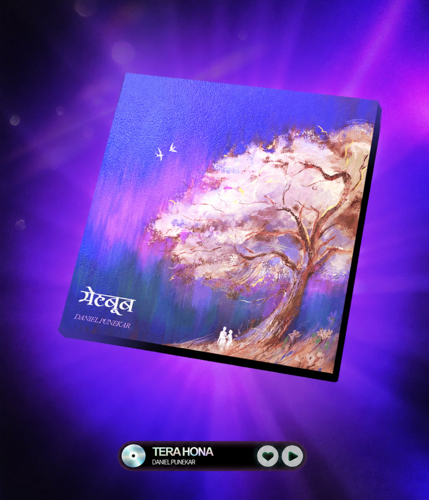
MEHBOOB
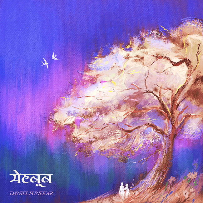
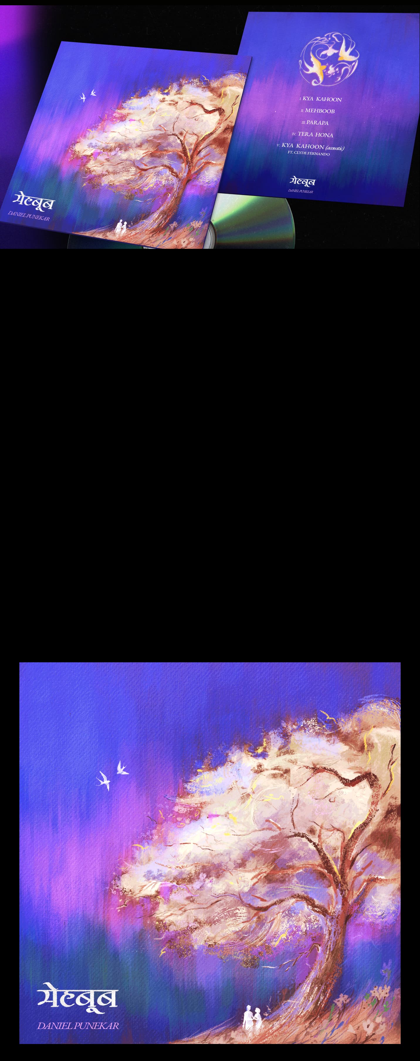
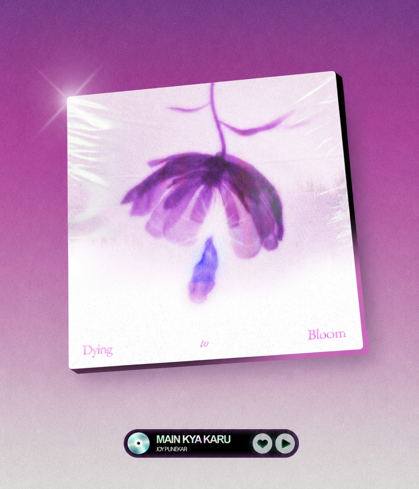
Dying to Bloom is the visual identity for Joy Punekar's debut EP, created to communicate the emotional world of the music into tangible visual output. The project explores a relationship that once grew with love, but gradually became a memory as the two people quietly drifted apart.

The brief was to create an album cover around a past relationship that remained emotionally present long after it was over. Two people who once grew together and the love flourished but silently drifted apart with time, leaving behind a memory that quietly stayed. The client wanted minimalism, flowers and the color purple.
Mehboob is a love ballad about the relationship between the Beloved and the lover, with a deeper biblical reading that draws parallels to the relationship between Jesus and His beloved. Thus, I went to reference my work from the same source of the song, the book of the Song of Solomon. The imagery referenced particularly its language of gardens, love, and longing, translating the tenderness of the song into an ethereal landscape that feels timeless, intimate, and poetic.
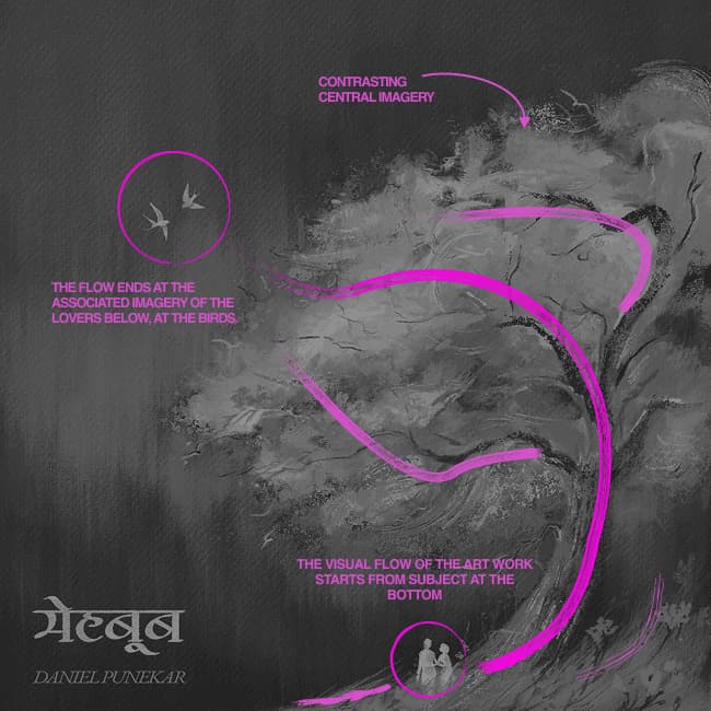
The composition guides the eye from the lovers beneath the tree, through its sweeping branches and into the open sky. This creates a gentle visual flow that mirrors the feeling of the music.
Drag the image slider to understand composition.
The landscape was digitally painted with expressive brushwork, layered textures, soft light, and an expansive sky to create an ethereal, intimate atmosphere. The two birds are the representation of the lovers under the tree, both represented with white, symbolizing the purity in love. These birds sit quietly within the negative space behind a darker background and at the end of the visual flow in the art.
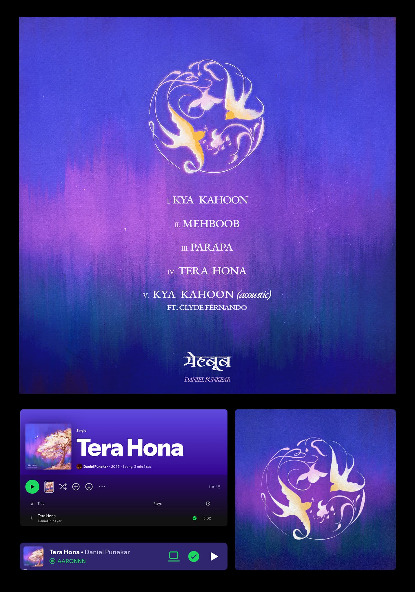
Typography was kept restrained, using variant of a an elegant serif that complements the inspiration while maintaining clarity against the artwork. The work features a different variant for a Devanagari typeface for the artwork as well.
The birds return on the back cover as the main graphic element, turning a quiet detail from the front into a recurring visual motif. The same atmosphere, colour palette, and symbolism extend across the tracklist and other EP artwork.
This is more honest to the actual project and, importantly, keeps the focus on the artwork. You don't need to manufacture "exploration" just because a portfolio template expects it.