NOT JUST A NUMBER
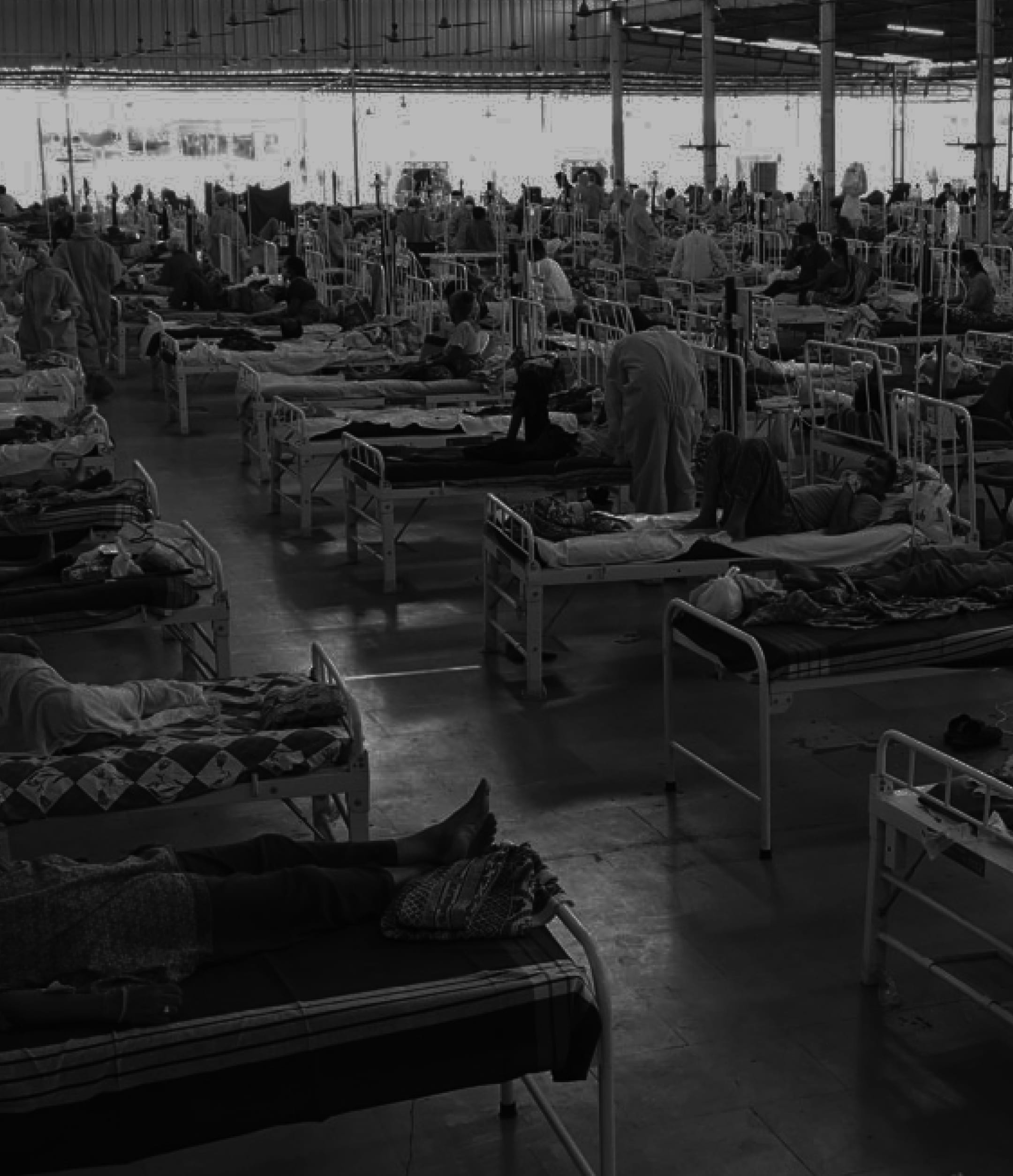
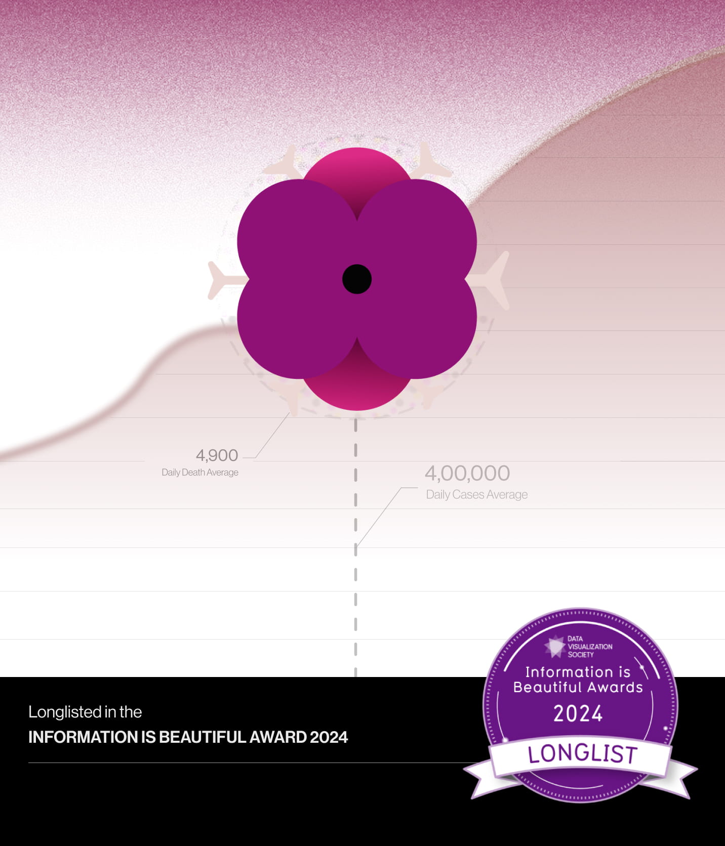
During the COVID-19 pandemic, India recorded millions of infections and deaths, most of which were communicated through charts, dashboards and daily statistics. This project reimagines that data as an editorial visualization, mapping the complete timeline of COVID-19 in India through flowers instead of traditional chart elements. By combining data with visual storytelling, the project aims to remind viewers that every number represents a human life.
Information Is Beautiful Awards 2024
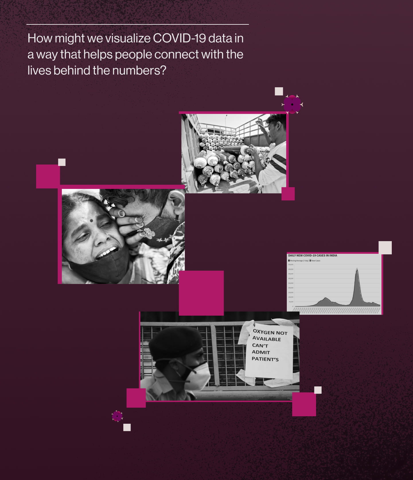
Most COVID visualizations clearly communicated the scale of the pandemic, but they often lost the human story behind the numbers.
Thus I set out with this question:
How might we visualize COVID-19 data in a way that helps people not only understand the numbers, but also connect with the lives behind them?
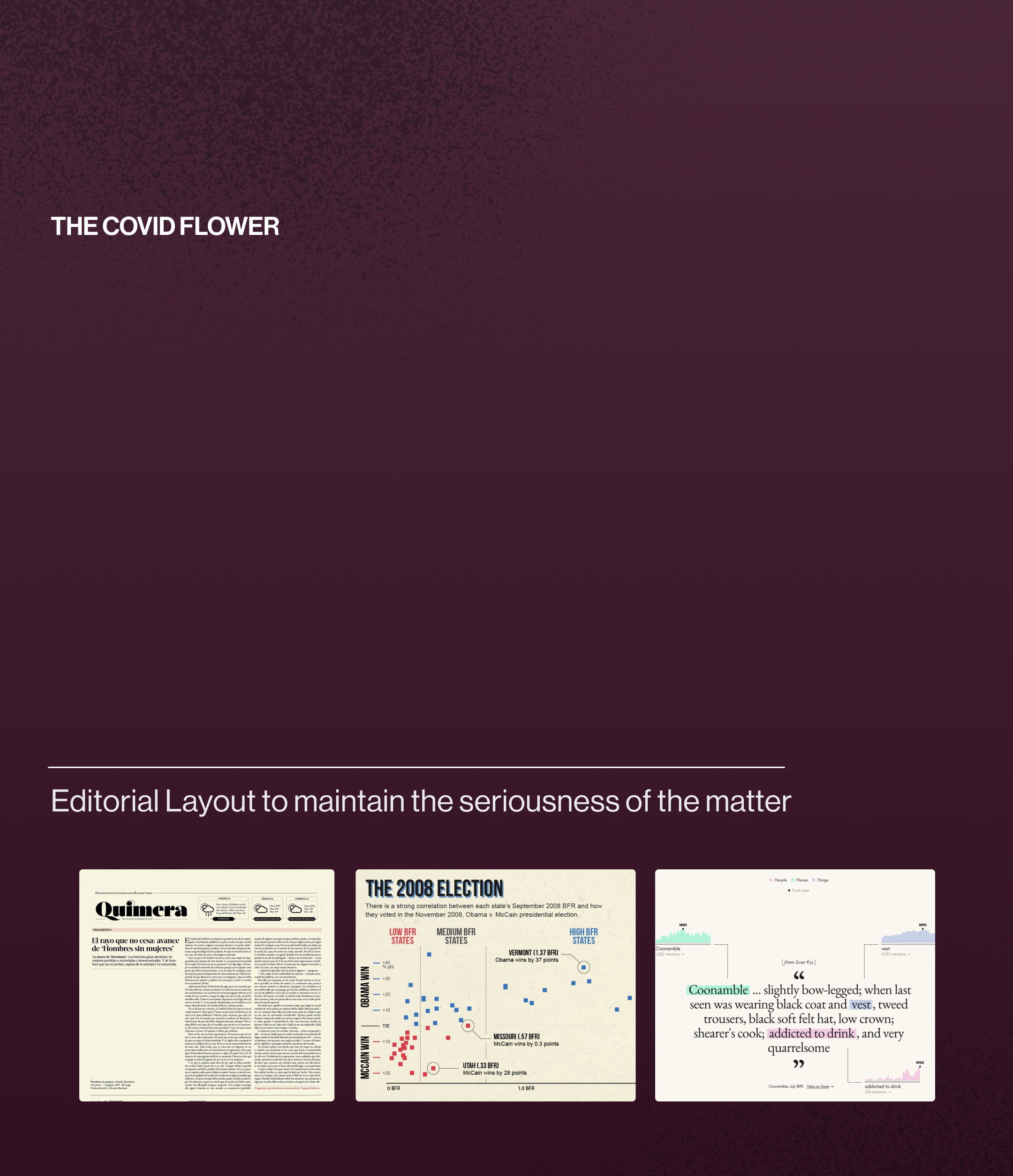
This project was longlisted for the Information is Beautiful Awards 2024. It visualizes the complete timeline of COVID-19 in India, replacing conventional chart markers with flowers to commemorate every life lost. The result is a visualization that not only communicates the scale of the pandemic but also honours the people behind the numbers.
Every design decision was guided by a simple question:
How can data communicate empathy without losing clarity?
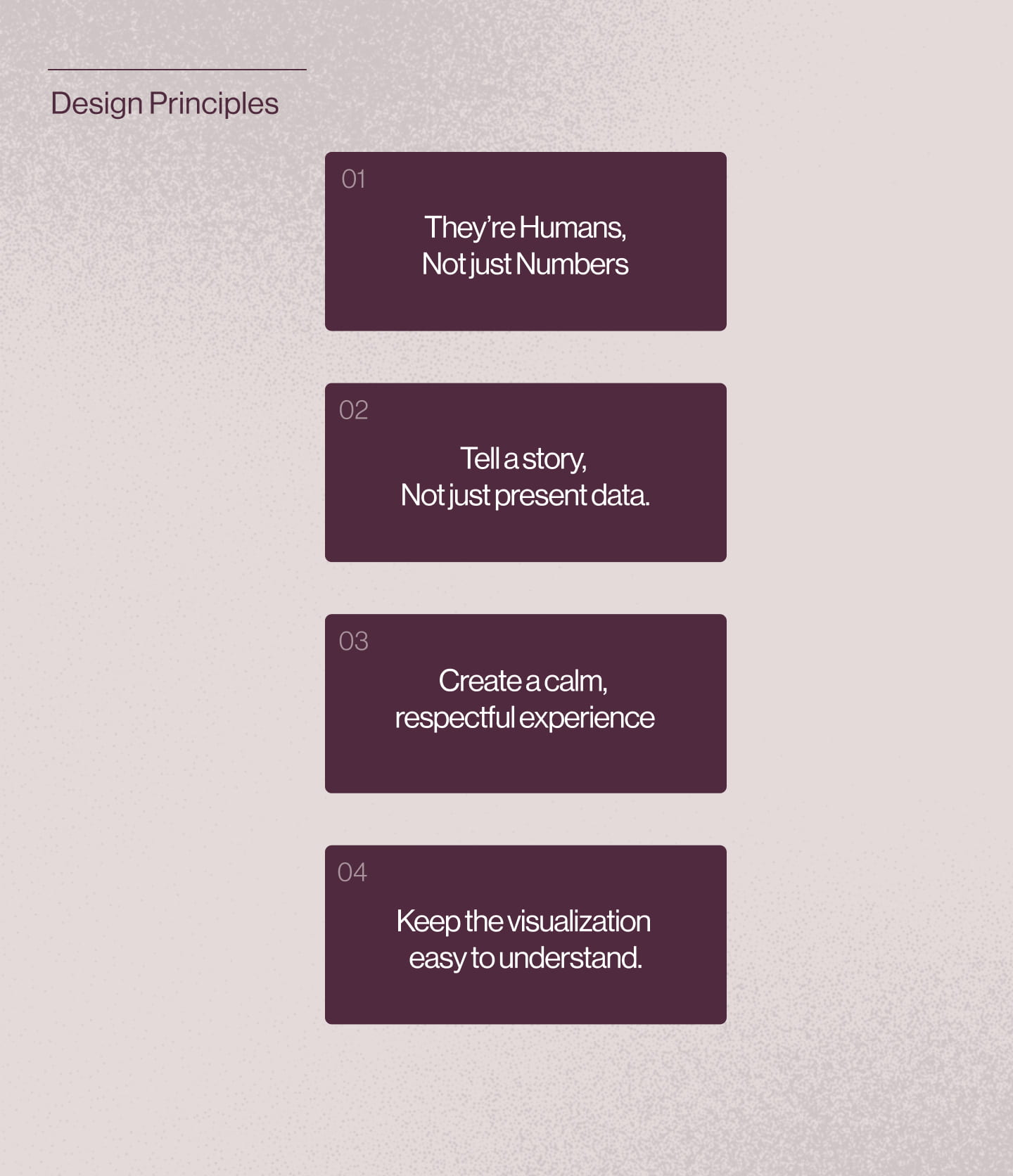
To keep the visualization focused, I established a set of principles that guided every design decision throughout the project.
Representing lives lost through a visual symbol required careful consideration. I explored different ways to respectfully commemorate those who died.
Flowers emerged as the strongest choice. Across many cultures, they are closely associated with remembrance, mourning and paying tribute.
Unlike traditional chart markers, each flower carries emotional meaning, transforming every data point into a symbol of a life lived rather than just another statistic.
This flower was also made to look like the COVID-19 symbol. Balancing the idea between the flower and the symbol of the virus.
Dataset → Analysis → Insights → Storytelling → Final Visualization
The project began with publicly available COVID-19 data, which was carefully analysed to identify key trends across the pandemic's timeline. These insights formed the foundation of the visualization, shaping how information was organized, prioritised and presented.
Rather than displaying the data through conventional charts, the insights were translated into a visual narrative. By combining accurate data with a symbolic visual language, the final piece guides readers through the progression of the pandemic while encouraging reflection on the lives behind the numbers.