BRITANNIA GOBBLES
A project focused on redesigning the packaging for Britannia Gobbles Fruity Fun. The challenge wasn't to redesign a brand from scratch, but to understand why an established product was becoming less noticeable on the shelf despite its familiarity and strong brand trust. The project combined consumer research with illustration to create packaging that felt more contemporary while preserving the nostalgia associated with the product.
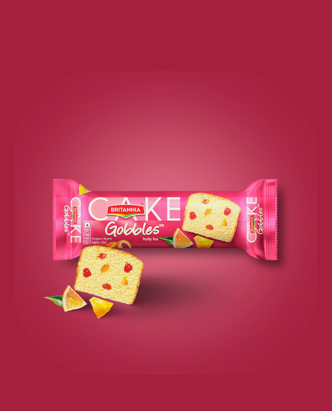
Britannia Gobbles Fruity Fun has long been associated with affordability, trust, and childhood memories. However, research showed that the packaging struggled to communicate its flavour and often blended into competing products. Consumers frequently misinterpreted the pink pack as strawberry-flavoured, while the fruit imagery suggested something entirely different, making the product less distinctive on the shelf.
The objective was to modernise the visual language of the packaging while preserving the emotional familiarity people already associated with Britannia. Rather than changing the brand itself, the redesign focused on improving flavour communication, increasing shelf appeal, and reinforcing the nostalgic connection through illustration and storytelling.
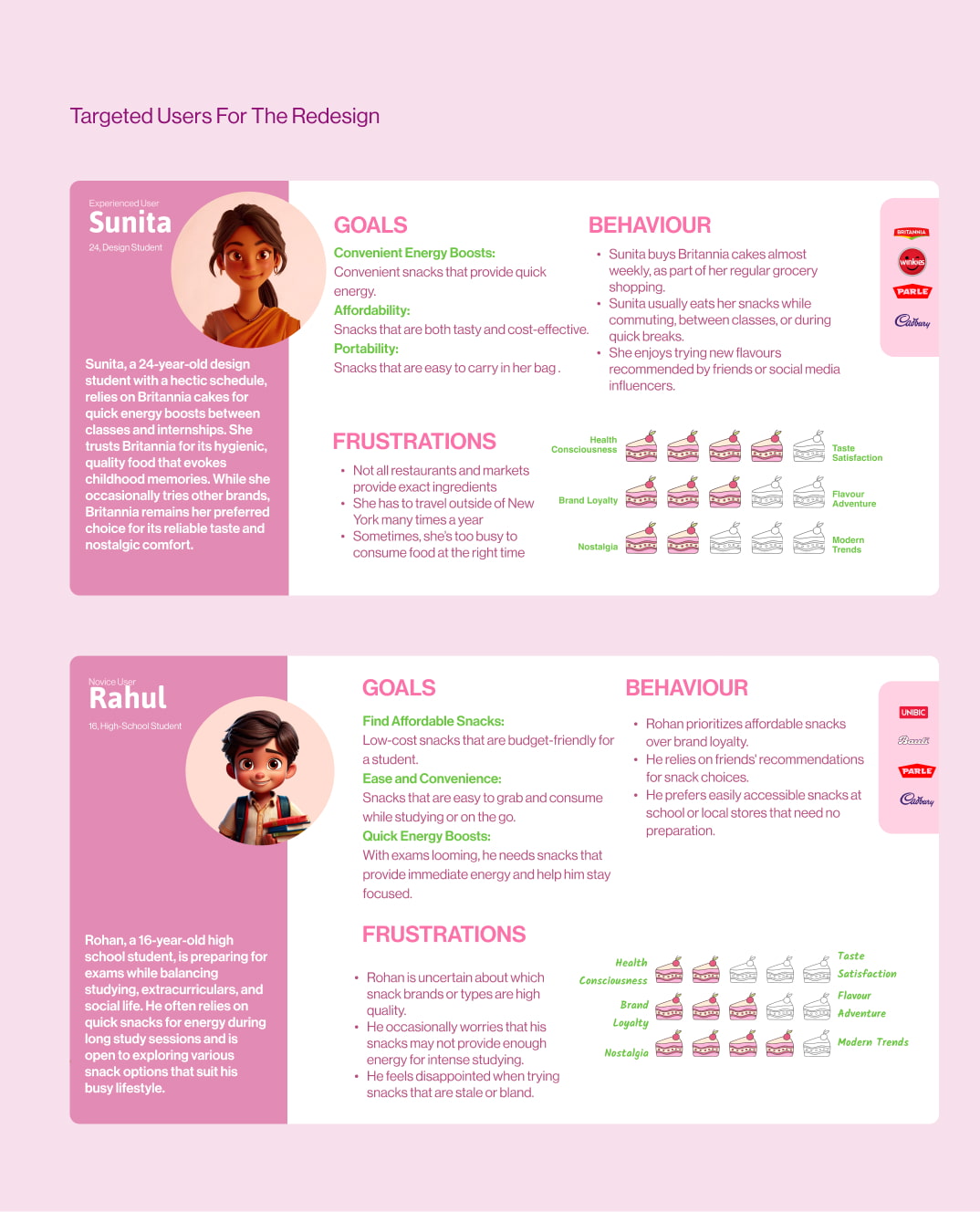
We used surveys, interviews, user journeys, experience maps, and consumer research to understand how people saw and chose Britannia Gobbles. We found that while the brand was trusted and strongly linked to childhood memories, unclear flavour cues, generic fruit imagery, and a dated look made the product easier to overlook.
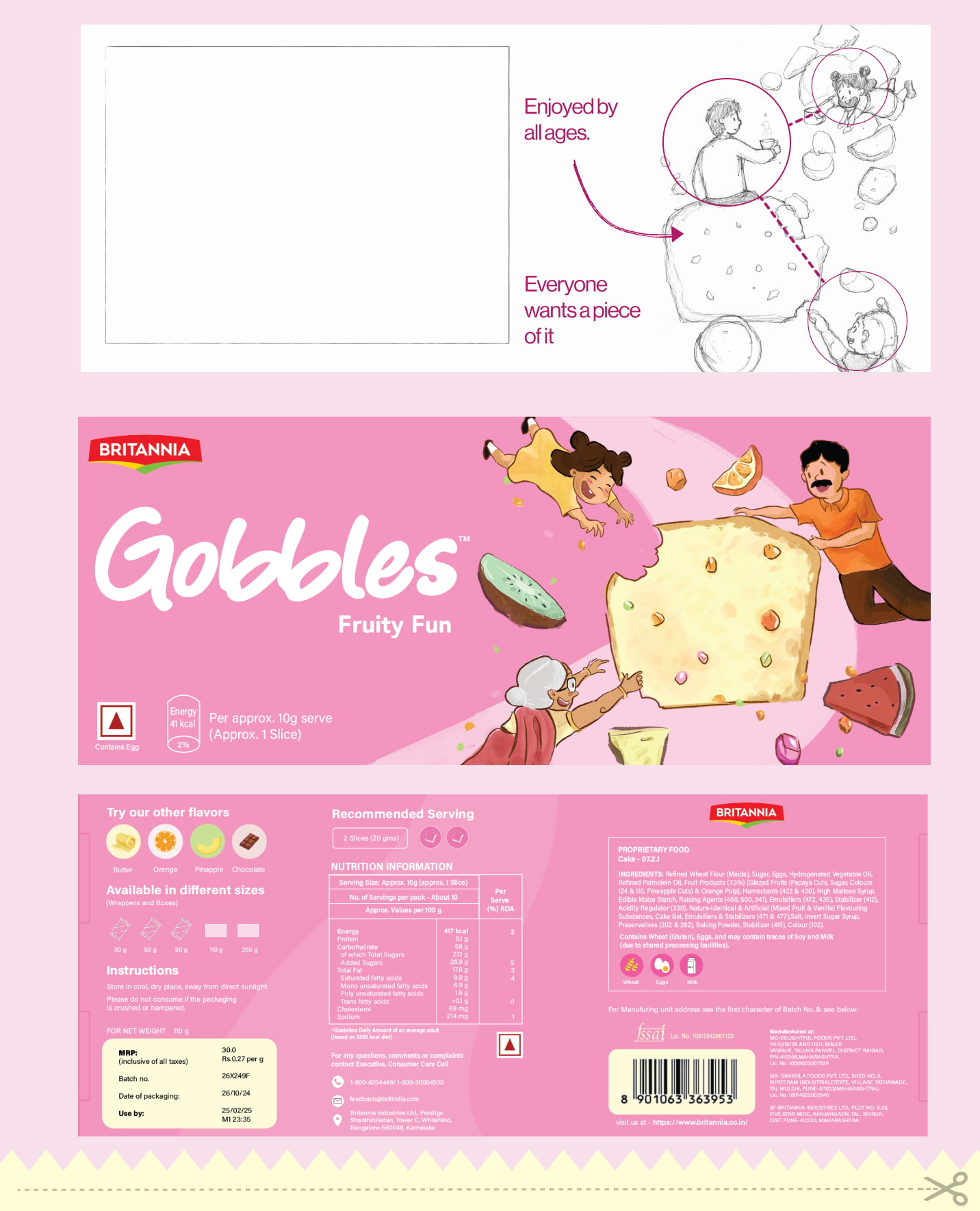
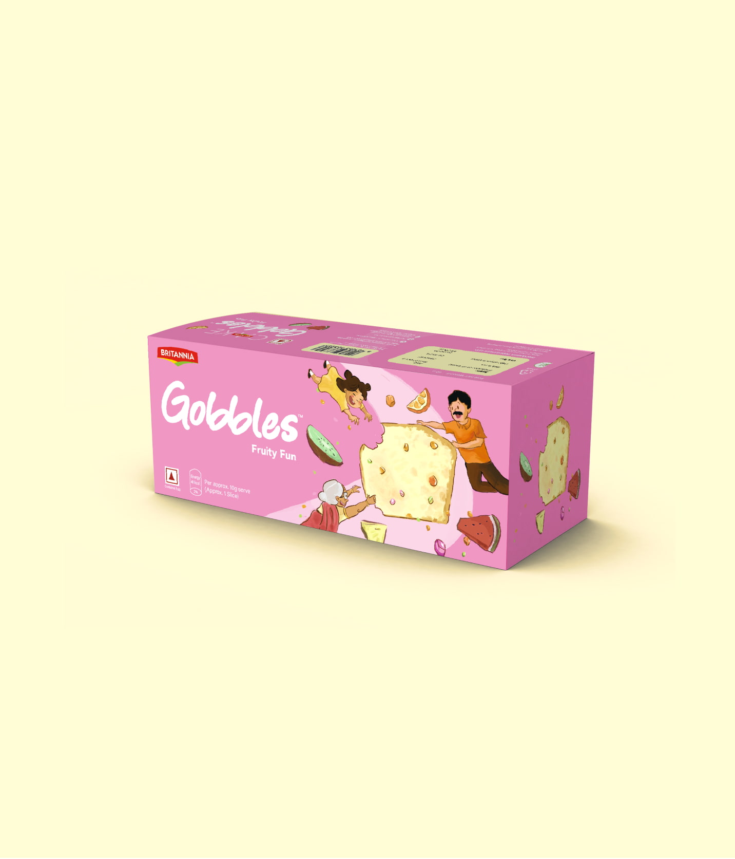
Instead of relying on product photography, we explored illustration to express both the mixed-fruit flavour and the nostalgia associated with Britannia cakes. We tested colour, fruit compositions, playful typography, and storytelling to find a direction that balanced familiarity with something fresh.
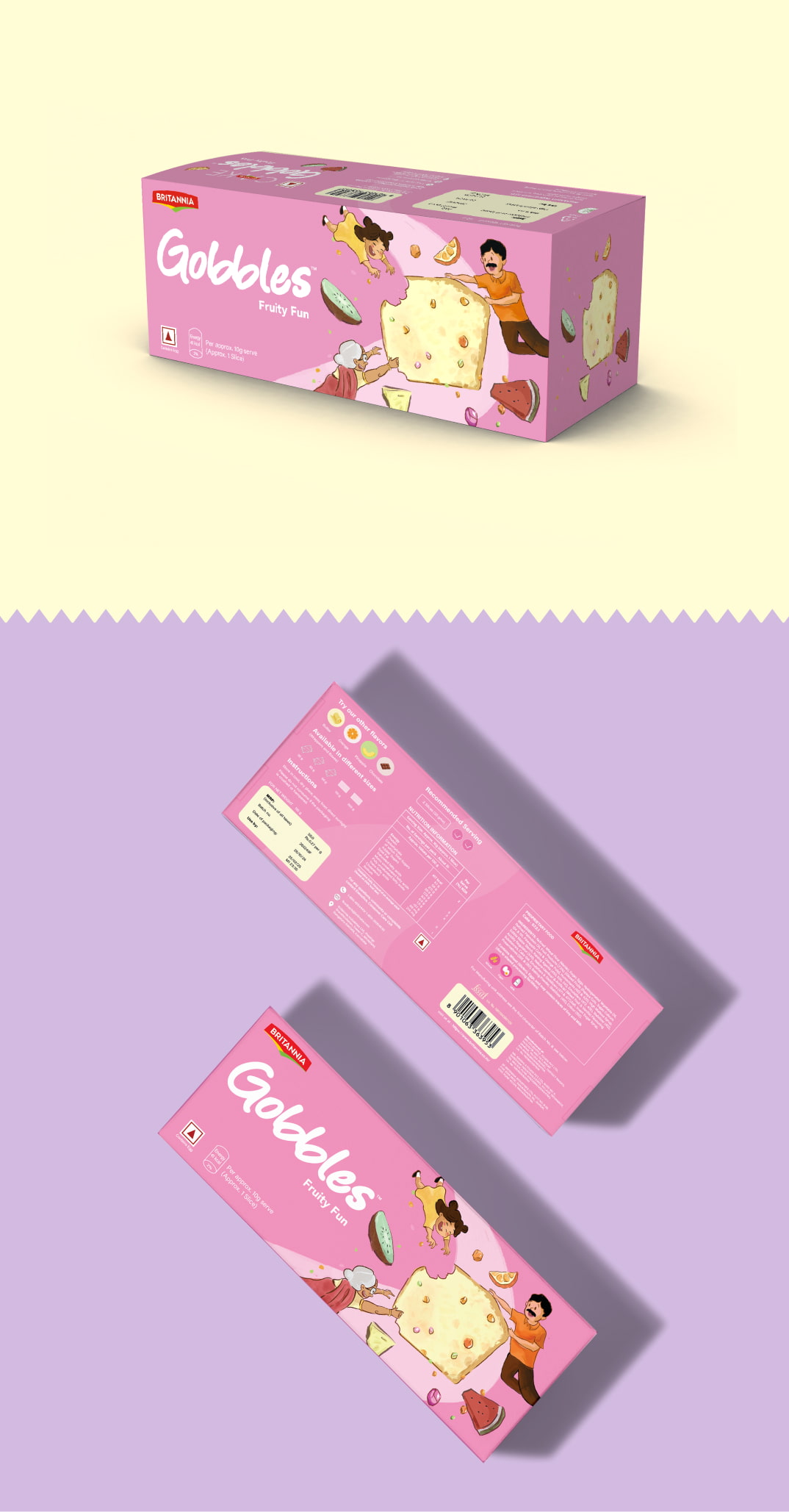
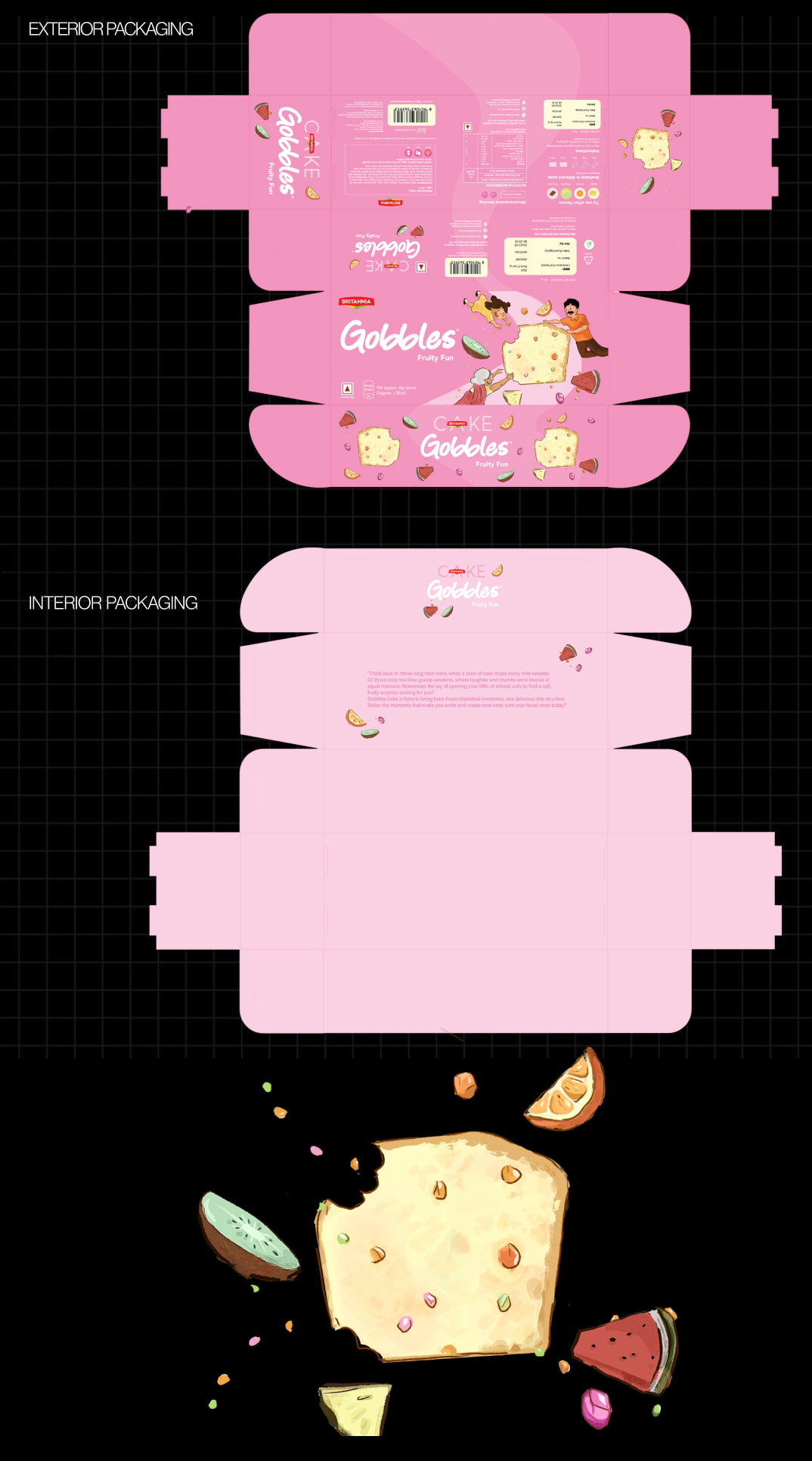
The final illustrations use richer fruit imagery, softer colours, and playful graphic elements to give the pack more warmth and personality. Illustrations of people across different age groups further reinforce the childhood memories associated with the product, while the fruit-led visuals make the flavour more apparent.
The redesign brought together clearer flavour representation, stronger front-of-pack hierarchy, and a more cohesive colour palette. The aim was to make the product more engaging and contemporary while keeping it recognisably Britannia.
- Stronger Brand Recognition
- Vibrant
- Nostalgic
- Legible
- Playful
- Transparent and Clear